We all prefer the path of least resistance.
Escalators over stairs, Velcro instead of laces, instant coffee instead of French Press – ok, maybe not that last one – but you get the point.
Nowhere can you measure the impact of a quick process over a longer one better than online.
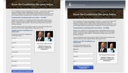
Here is an interesting experiment that NextAfter ran for one of their clients. They wanted to see if they could improve the results of Hillsdale College’s Constitution 101 course by making the process to sign up appear easier. Optimizing the process is important since the course is one of the biggest sources of new emails and donors for the college. Previous experiments had been able to increase the conversion rate of the donation page and had increased the number of visitors to the page. However, they had been unable to build upon the success of the initial form for the sign-up page.
So they decided to try something wild, like adding more steps to the process but making those steps quick and easy. They divided the existing form into two steps; name and email would be first, followed by the participant’s address. To be sure that this change didn’t jack up something else they were sure to track every step of the process.
Research Question:
Does dividing the sign-up form into multiple steps increase the number of emails, addresses, and donors we acquire?
The Experiment
The Result
The two-step form increased the email conversion rate by 17.6% compared to the control. Not only that but all other key metrics (home address collection and donations) increased as well.
By visually making the form shorter and easier to fill out, the mental friction of having to fill out a longer form was removed, thus more people were willing to do it and the conversion rates for each step of the process improved. Even though they added more steps to the process, making those steps quick to complete improved the entire process.
The biggest surprise was the increase in the donor conversion rate from .61% to 1.2% – a 93.7% increase. Asking viewers to make a series of smaller “micro yes’s” made it easier for them to decide to make the bigger “macro yes” of giving a gift.
The visual layout of a page, even if it has all the same content, does affect people’s willingness to go through it. Great principle to keep in mind as you look at the layout of your donation page. There are hundred’s of experiments like this on NextAfter’s website, I would encourage you to head over there and check them out.
To get sent new blogs via email, sign up here:
Related Posts

Next Level Email Automation
Bing! How long after you hear the…

Nonprofits Leaving Billions on the Table Due to Fundraising Failures
Looking at the data after giving online…

Is Our Donation Page Chasing Donors Away?
Getting people to give is hard work. It…