Getting people to give is hard work.
It gets even harder when potential donors get to your donation page and they abandoned the process because the form looks arduous to fill out. That is exactly what we found in this optimization test.
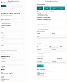
The main donation form on this organization’s site had historically used the out-of-the-box styling options that came with their donation form widget. This styling had each field stretch the full width of the screen with each field on a separate line. This layout created a long page that had the impression of requiring a great deal of information.
Our hypothesis was that the increased form length created cognitive friction in the donor’s mind which ultimately would be affecting the conversion rate. As a result, we wanted to rearrange the fields to create the impression of a shorter form.
Research Question: Does reducing the visual length of a donation form reduce friction enough to improve conversion?
What we learned
The rearranged form created a 39% increase in donor conversion. So it is evident that the friction created in the mind of the donor by the long page was affecting performance. In addition to utilizing shorter forms in the future, we are also going to look for other ways to minimize the visual impact of the donation form.
You can see this entire experiment (and hundreds more like it) in the NextAfter Research Library.
To get sent new blogs via email, sign up here:
Related Posts

Next Level Email Automation
Bing! How long after you hear the…
Keeping Your App Fresh, Lessons From Pokemon Go
Keeping an app fresh, relevant, and…

Nonprofits Leaving Billions on the Table Due to Fundraising Failures
Looking at the data after giving online…